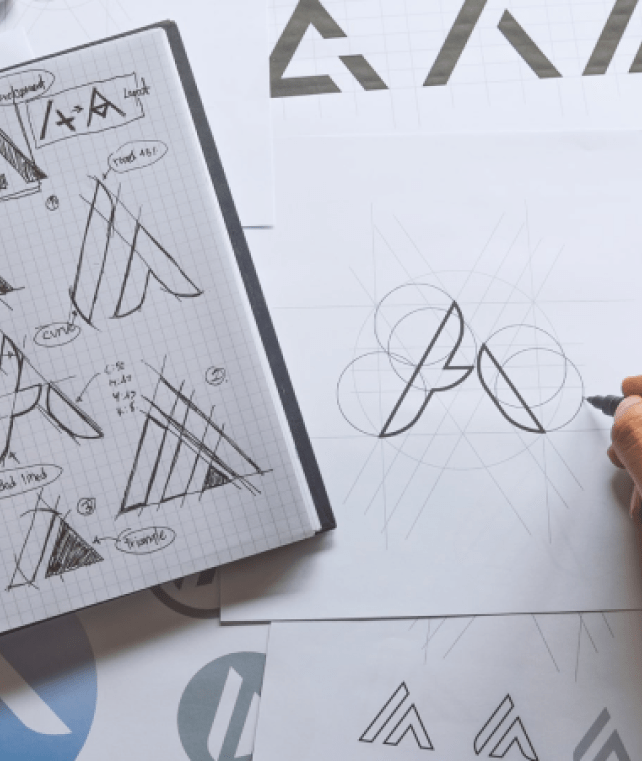

At Rarepublic, we regularly work with entrepreneurs to help build strong and memorable brand identifies. But long before, in the early days of our company, we struggled with developing a design process that produced consistently great results. Having gone through the battles and having earned the scars to prove it, we felt that it was our responsibility to share our insight to help pave the way for new creatives taking up the mantle. In this piece we have broken down what considerations need to be made when producing a remarkable logo design. We have shared key insights from leading designers and brand directors that we have collected and mulled over throughout the years and distilled these into our top 4 principles.
If your symbol is difficult to see, or your typeface is hard to read, then a little re-modelling session may be in order. Consumer attention is scarce, which often results in a limited window to capture and connect with your market. Unclear logos lead to unexpressed feelings of customer frustration and confusion.
Chris Do - Founder of The Futur, stresses that "legibility should supersede any kind of decorative element that you do."
We found that the issue around design clarity was found in younger, less experienced logo designers that focused more on artistic expression and distinction. The need for distinction over clarity was also fuelled by pressure placed from clients for something "unique" and "fresh" forcing designers to overlook the basic fundamentals for effective design. We often recommend being extremely conscious of font weights and the line-work of your shapes as you experiment with different points of scale for your logo.
Our founder - Rajpal Singh states,
‘Clarity helps create trust, and without trust there is no brand.’
Design specialist, William Peterson, stresses the need to consider"flexibility" when approaching functional logo design. Can a logo be chopped, shrunk, and enlarged, but still be identifiable?
Two great examples of the importance of logo functionality in practice are directly present in the fashion and automotive industry. When designing a logo, we must ask ourselves, is this logo transferable across different materials?Would this logo look great on the bonnet of a car as well as the head rest of its interior. Similarly, could this symbol print well on a polyester T-Shirt and at the same time be embroiled onto a cotton hoodie? Considering logo functionality allows you to consider production risk. These choices can not only save your client hundreds of thousands of pounds in re-printing costs but can also help enhance the quality of your logo's application.
A general rule of thumb we follow is that if the design looks great in its purest form, with no colour, then it has the potential to become a great logo.By focusing on form first allows you to produce striking shapes and typefaces that can then leverage effective colour palates as you proceed to refine your piece.
Renowned brand director - Sagi Havi, Chermayeff & Geismar & Haviv, expresses the need for logos to have their own "personality." He uses a great example of how companies operating in the fashion market would want their logos to be elegant. In contrast, a sports brand would go for a feeling that is bolder and more dynamic.
At Rarepublic, we believe that for the right brand personality to be developed, we need to place the core customers at the centre of its design. If the logo is not relevant to the market, then its personality will fail to shine amongst all the noise.
Taking time to understand the landscape allows you to understand better understand the positioning of the brand and the behaviours that drives its consumers.
Luckily, over the years, we have had the pleasure of working with many new creatives whilst analysing their approach to design. We typically found that thesenew designers would either focus too much on artist expression which led to unclear designs or were too ridged with their structure which took away the pizzazz from their design.
We came to an understanding that an Imbalance across any of our principles often created dysfunctional, uninspired, and distorted logos.
Sagi Havi also stated that a memorable logo is one that is "unusual enough to stick into the mind," but also stressed the need for 'simplicity' to maintain function.
We often give new designers the freedom to express their ideas as long as these ideas stay 'relevant' to the brief. We recommend focusing on volume over quality in the ideation phase to help with design fluidity and creativity.Setting time constraints allows designs to maintain an element of simplicity, which contributes to the logo's function. Having a clear focus point, also allows for greater productivity across the process.
The ability to strike a balance between our four principles is no easy task, but being able to do so will allow for consistently creative and memorable brand designs. We encourage new creatives to have these principles at the back of their minds, as a guiding compass to create the strongest foundation for their brand design work.
We love speaking to new creatives, so if you found this to be useful, or if you would like to share your portfolio for advice then please do reach out to us on info@rarepublic.co.uk